Iconography
Icon design for Instasize/Made app, and just for fun!
UI Design/Graphic Design/Strategy | 5+ years
̌
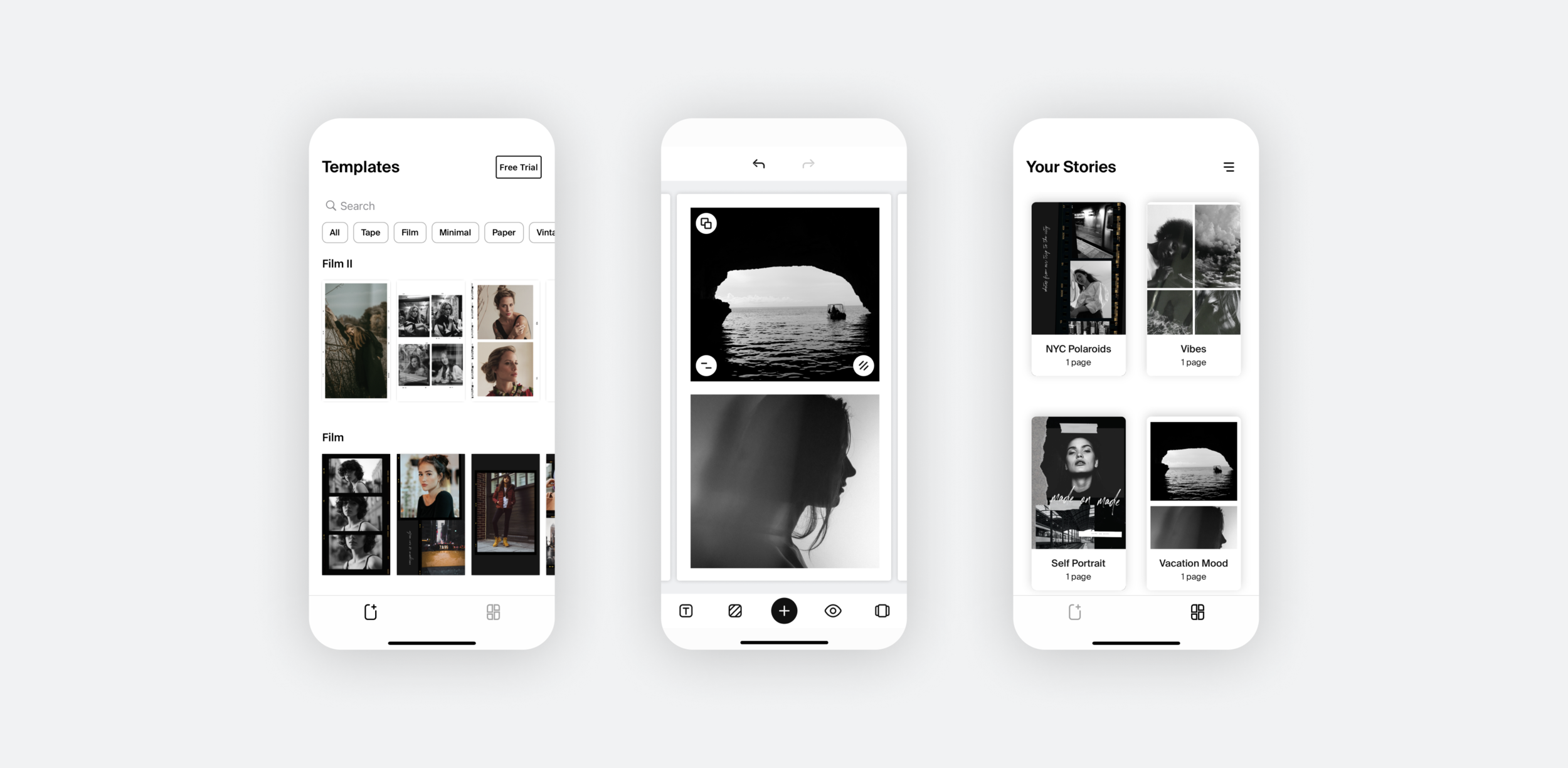
These thumbnail icons helped users navigate our Instagram stories quicker. Icon representation: 1. Blog 2. Downloads 3. Tips & Tutorials 4. Brand Ambassadors 5. Favorites 6. Influencer Tips/Tutorials
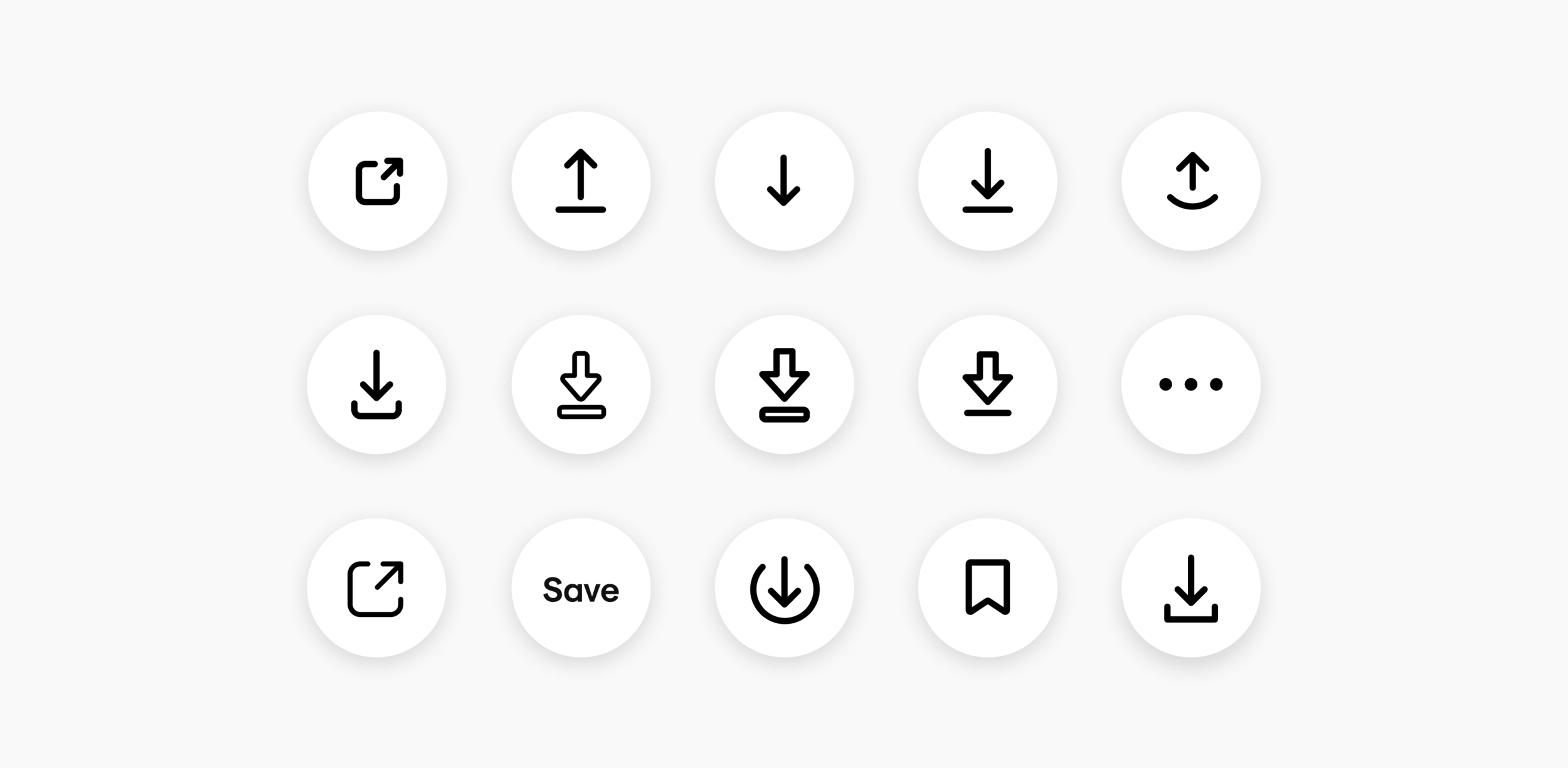
Here is a little glance into my process when creating icons. I strive to come up with as many different interpretations of a particular icon as I can. First I research the meaning of what it is I’m trying to convey, and then I look at inspiration. The goal is to create an icon that is easily understood and also upholds the brand style guide. After I’ve decided on the general direction, I’ll create more iterations until I finally settle on a few I’m confident in. These icons will then be a/b tested (if necessary) and then the decision of the icon will be based on the results from the a/b tests.
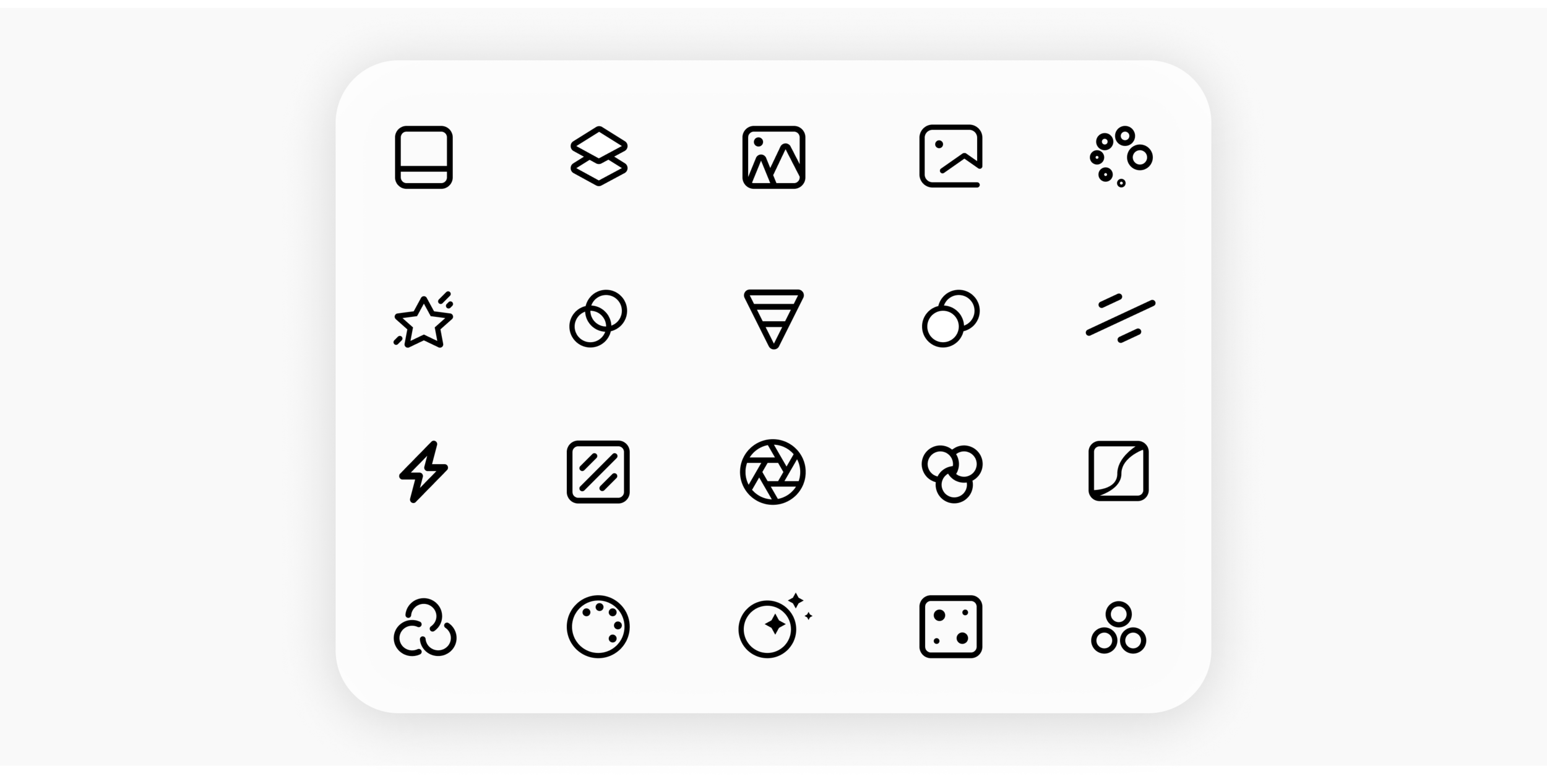
This icon has gone through many variations during my time at Instasize. “Filter” has such an ambiguous meaning that it’s difficult to convey visually. This is why it’s so important to test icons! Ultimately the first icon in this set out-tested the variations, and I think it’s because it’s direct representation of the filter thumbnails in the app.
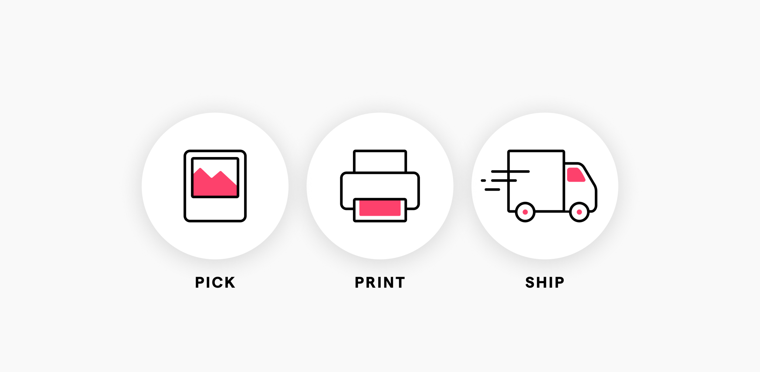
This is an oldie! I designed these in 2017 for a popup in Instasize. We used to print and ship your edited photos to you. The feature wasn’t successful so it was taken out quickly but I remember being so proud of these icons so I have to showcase them to remember how far I’ve come! It’s also a solid reminder that you’re going to “ship” a lot of things that will fail more times than they succeed and that’s okay!
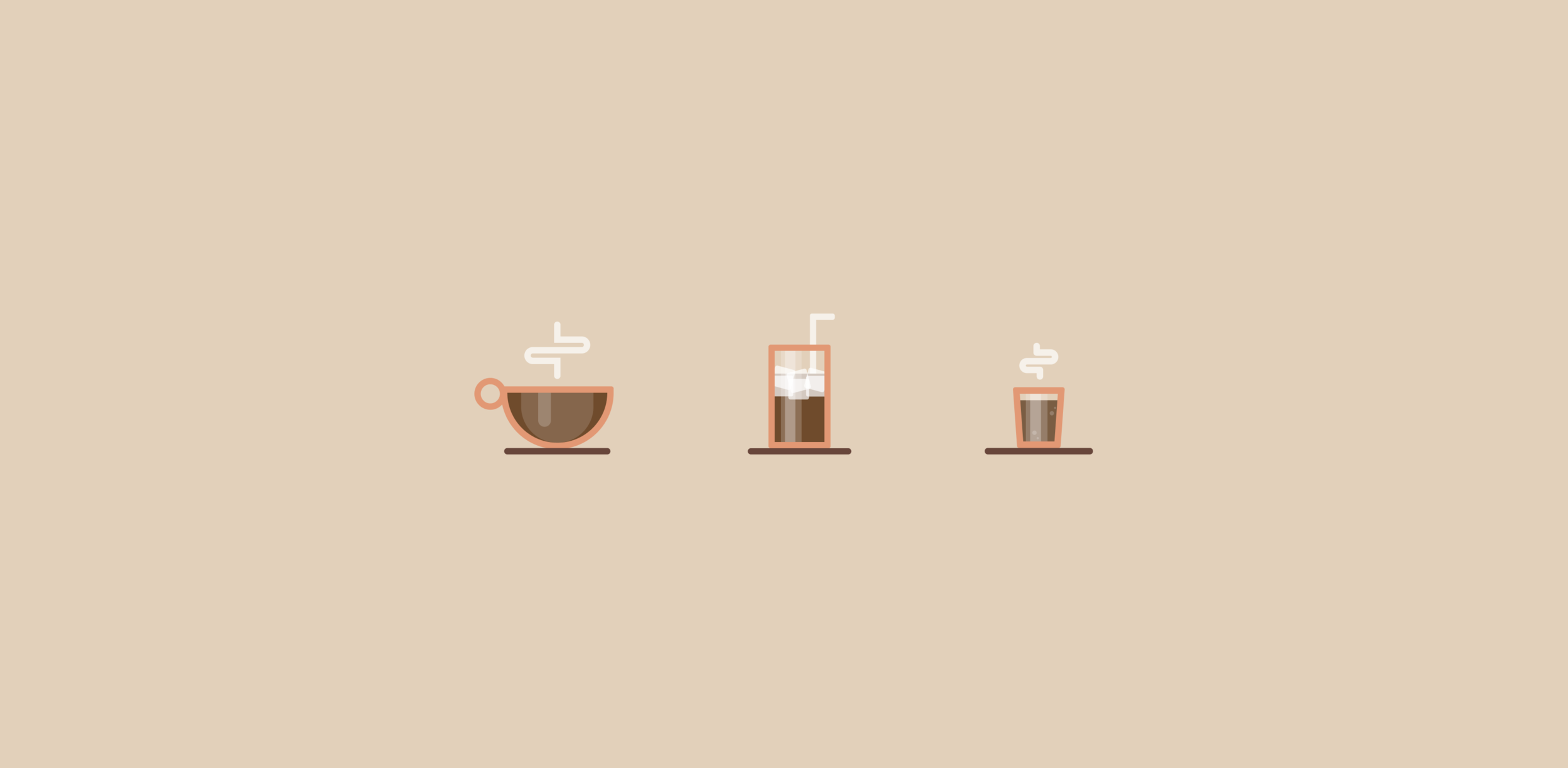
Hot coffee, iced coffee, and espresso! I really enjoy creating icons in my free time. Here’s a fun little drink series I started.
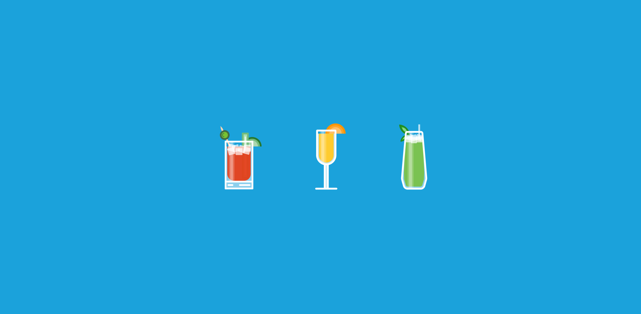
Here’s a few more from my drink series. My favorite thing to do is go out to brunch with my loved ones and have a few Bloody Mary’s!


